

Project Overview
The customer portal was originally designed to meet a very specific workflow that no longer applies to Elite EXTRA’s needs, and the company is now adapting this tool to meet a new need. The new focus is on providing a method for buyers who have received deliveries to submit return requests for items that are no longer needed. Previously, it was merely a tool for users to track the status of their existing orders, and submit new orders or return requests. This tool integrates with the primary software, where return requests can be approved, dispatched to a driver for pickup, and return credit can be tracked.
Problem Statement
Users cannot create and submit more than one return request at a time, which slows the process and makes them less likely to create the requests, resulting in poor documentation for the sellers. The workflow is currently not user-friendly and does not align with Elite EXTRA’s current design standards (See my reflection for an overview of this process).

Objectives
- Enhance the user interface of our customer portal to align with updated design standards.
- Integrate a “shopping cart” approach for submitting multiple return requests.
- Enhance accessibility to returns documentation.
- Simplify workflows to facilitate customer self-navigation without external assistance.
My role
The team consisted of the account manager responsible for the returns project, a member of the Product development team, a UI developer, and myself.
I was the only UX Designer working on this project. Many of the tasks that I engaged in are listed below; the list is not comprehensive.
Responsibilities
- Survey writing
- Qualitative data analysis
- Existing UI analysis
- Mockup sketches
- Creation of a high-fidelity mockup with a realistic feel for demoing
- Compiled user feedback and mockup updates
- Acted as a liaison between the account manager and the UI Developer
- Provided feedback and quality assurance testing to the UI developer during the development phase
Users
Seller – Wholesale Hub (fictitious company)
The seller is Elite EXTRA’s primary customer. The seller will deliver items to the buyer using SwiftTrack’s routing and dispatching software. This user desires a simple way to receive requests to return purchased items, track the progress of those requests, and approve or deny them. While they are Elite EXTRA’s primary customer, they are not the primary user of the customer portal.
Buyer – Service Central (Fictitious company)
The buyer is a customer of a seller and has only a secondary connection to Elite EXTRA. The only interaction they have with the Elite EXTRA software is through the customer portal. They are the primary user of the customer portal, desiring to create and monitor orders and returns.
Research
User needs
Elite EXTRA conducted a customer satisfaction using the UX survey platform Maze to gain feedback about the current user interface. We received a modest 70 responses to 6 qualitative questions, which I analyzed to discover the primary themes. A short summary of the findings is below.
Overall Insights
- Form is secondary to function. Users care more whether it works than how the data is laid out or how it looks.
- Ease of use is key as many users report not enjoying or being comfortable with using technology.
Strengths
- Orders are easy to find
- Tracking orders and viewing status updates is not complicated
- Simple and organized (Data display)
Weaknesses
- The interface is confusing, and workflows are not clear
- Difficult to submit multiple return requests
- The tool is occasionally unstable, causing glitches and errors in reporting
- Return process is not easy to figure out at first
The team also conducted a focus-group style interview with several of our customers where we walked them through the mockup and received initial feedback. There was a lot of positive discussion, and improvements were made based on the comments.
Competitor analysis
In preparation for this project, I studied many large retailers’ online purchasing and order tracking interfaces. The goal was to determine patterns between them and create an interface that features a familiar structure.
Ordering (purchasing), tracking, and returns processes were analyzed from the following companies:
- Amazon
- Target
- Walmart
- Kohls
- NAPA Auto Parts
- O’Reilly Auto Parts
These websites all had similarities that the team chose to emulate.
- Card-based order information displays
- Real-time updates of order statuses
- A shopping cart for collecting and submitting orders
- A subtle but accessible option for returning purchases
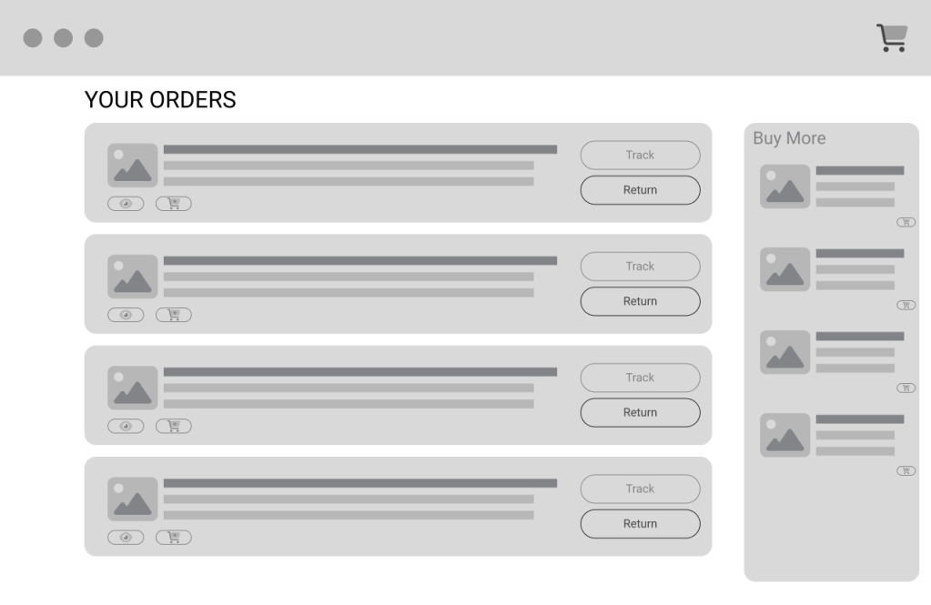
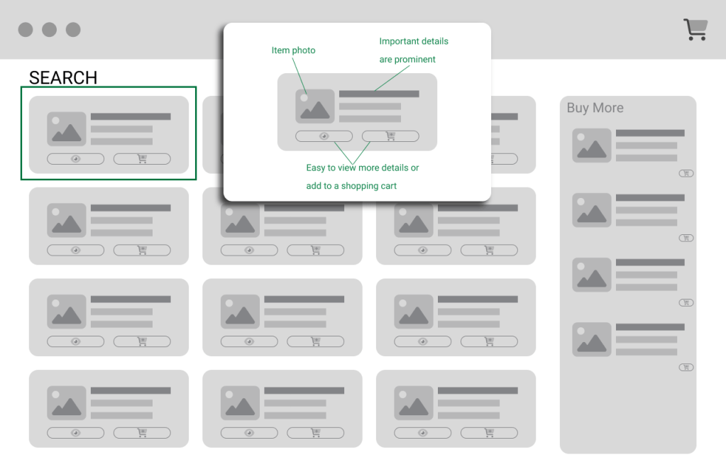
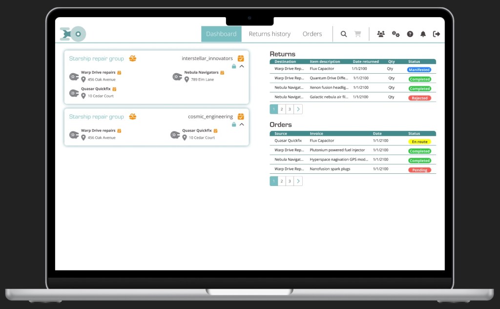
Sketches and mockup images
Results
The updated portal was released to customers in January 2024. After the adoption of the updated customer portal, there were no complaints received from the end users. Updates to the process have continued to fill in needs that were not initially identified. However, the adoption of the new workflow was an overall success, and the volume of requests has increased since this update went live.
Disclaimer: All content is original, but AI-based tools have been used to check grammar and improve readability. Some generative AI tools may have been used for mock data and user personas.
